Showing posts with label practice. Show all posts


I'm actually really looking forward to getting do my assessment. I've got my outfit ready and I learned from my hair assessment faux pas that a short sleeved top is more suitable- No one likes being a Sweaty Betty.

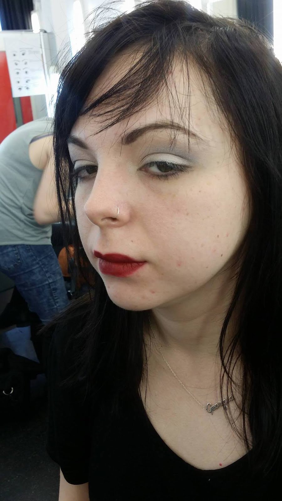
I organise with Sophia a suitable time that I can practice doing her look. I arrive early to set up and I get everything that I need, including a few products she could potentially swap out and try instead.

Sophia arrives and I feel fairly professional and then she pulls out her face chart...

...


And it looks completely different to what I had seen and practiced on myself. Well, this is going to make things really interesting. I keep a pokerface and I gently inquire as to why she's changed the design so close to the assessment. I didn't really get an answer other than " I just didn't like it," I shrug it off and begin to crack on.

A white base. Pretty simple. I crack on with that and ask her if it's heavily powdered, she nods and I powder away. I love the smell of the Illamasqua powder, smells like vanilla icing sugar. I'm just about to start contouring with the purple and she jumps in really quickly and says that she doesn't want the contouring done. I look a little perplexed but I carry on with her wishes.

I start with the eyes. I follow the design as closely as I can and I'm constantly asking her for her feedback, unfortunately I don't really get much in the way of good communications. So I'm not entirely sure what I'm doing, I become a little frustrated when I start applying eyeshadow and I ask her if the placement is right and when I've done eyes she informs me that there is another colour that needs to go on. It's just a bit of an inconvenience, nothing major. I jot this down on my notes page.

Now come the eyelashes, I've never really been any good at these. I didn't have an scissors either which meant I couldn't trim them down. Before I even consider putting the eyelashes on it's dawned on me that she hasn't done a patch test. I ask her if she's used Duo before and she says that it's her regular brand of eyelash glue that she uses.

With a little bit of a prayer, I managed to SOMEHOW get symmetrical winged eyeliner. I can't even do this on my face, let alone anyone else's. OK, maybe I used a little initiative and thought about how I could replicate one side. And then it dawned on me. I can use a make up brush/stick to 'mark out the brows' This is a popular method that maybe people use today. All this entails is holding up a make up brush with a long handle and place it just next to the nostril and match it up to the outside edge of the eye. This means you can get the eyebrow shape right. I did this to make it easy and to save time when you are in a hurry.

I was really happy with how well this particular part came out, it's so satisfying to get matching eyeliner. It's just one of those things you can't explain to someone who isn't a fellow make up junkie.

I put some purple Supracolour though the brows and these framed the eyes really nicely. Although


You know when you go into a room feeling really confident and it becomes painfully clear that in actual fact you haven't got your act together? That was me today.

I had book a session with Sharon previously and not shown up due to an unforeseen circumstance. So I made my way in on my 'free' Tuesday to see what I could gain from this 10 minute window.

Sharon's first meeting had over run so she asked me politely if I minded coming back at another time and I had no problem with this. At the newly appointed time I return and Sharon still isn't finished. I just sit outside and wait. Thinking about how much of an improvement I've made on this blog recently. I make a list of things I'd like to bring up otherwise I would forget them.

My Questions and Queries:

  •  Minimum amount of posts for New Elizabethans
  •  Length of Blogs?
  •  Do we blog about shoots?
  •  Attendance 16th/23rd 
  •  Good habits for make up assessments


I get called into the office. The opening question is:

"How are you getting on?"


Now, normally I just answer this with the typical "Oh I'm fine" because that's what I'm used to doing, but this time I just answer honestly and said that I was struggling and I feel as though it's impossible. Just saying that out loud was in itself the biggest relief because it feels like a demon I've kept hidden for ages.

Sharon just smiles, and asks me to put my blog on the Mac. I comply and hold my breath as she begins to scroll. It was an absolute relief when I heard her say how she loved this and that, calling Kat over to look at my work and just chatting to me about things I've done.

I decided I'll bring up 'Length of Blogs' to start with. So it turns out that one of the points of having this blog is to reflect on things I've done, find inspiring and to record my journey from the research to the final result. Sharon likes how much I write and says I seem to be a naturally reflective person. The only thing that I can improve on in that sense is that it is really easy to make a list at the end of a practice session or an outcome of things to beat myself up about. Instead of doing this I need to make sure that I use points like this to be the driving force for improvement.


So instead of doing this:

 "I didn't like that result"

Do this

" I wasn't happy with the result, so next time I'm going to....and why..."

It turns the negative into something with potential to be positive and have a better result for the next time.

What Sharon wants to see more of in my blogs:


  • Reference and Visuals of what I find inspiring
  • This ^^ but consistently throughout my posts
  • Photos of practice outside the class. Stuff I've done in my own time and a reflection to go with it
  • Links/Drop in YouTube videos of things that are relevant to my studies.
  • Photos of when other people practice on me and how this will help me
  • USE BOOKS as references, there's more to life than internet references
  • Tidy up my blog, she really likes the layout. (I knew my gut instinct was right about a simple and clean layout BOOM) DONE
  • Complete missing blog posts.
I'm feeling great at this point and i'm feeling fairly positive and then the cartoon style 10 tonne gets dropped on me from a great height:

30-35 BLOG POSTS FOR THIS ONE ALONE

It's at the point i'm pretty certain I have an outer body experience and I know my poker face failed. As I come back down into my body I can hear Sharon telling that it's going to be OK and it's still doable. 

T
I
M
E

M
A
N
A
G
E
M
E
N
T

IS THE KEY.


What I need to do:

  • BIG DIARY OF DOOM. Or just you know, 2016. The A4 one seems like a good idea.
  • A mini version with a week to view. That way I can plan my week
  • Spend an hour a day blogging and then leave it.
  • Make a super list and bring it with me to my next tutorial (Tomorrow at 12pm or 1pm
  • Plan everything. It makes it easier to do.
  • Become more proactive in seminars to see what needs to be made into a blog post.
  • Make sure I have a black outfit for tomorrow, my notes and everything I need for my assessment tomorrow.
Is this doable? Hell yeah.

So far I've already thought of 5 new blog posts for this one alone. I've made the drafts already and put a bit of blurb in them so I don't forgetful when I get home/when I next open up blogger.

After practicing on Sophia tonight, I'll take photos and evaluate them and prep some notes for tomorrow.

Sharon is ace.


xo
I always find Sharon's Seminars interesting. I feel as though there's always a good amount of Education vs Discussion in them and we feed off of each other's thoughts, opinions and knowledge. After the though provoking week of doing final designs (Translation: Week of hell that was conjoured because of artist block) I had to prepare my presentation on the lady in waiting that I chose.

I tried to keep it short and sweet. I gave the history of her but really made a point of explaining the story of her trip to the tower. After all, this is what inspired my design.
Then the blissful presentation turned into something terrifying.
Critique Mondays!


It's the first time I've ever had my designs critiqued. I'm always scared of this ebcause nobody wants to hear their designs are rubbish. I'd even said this to Sharon before I started my presentation. I laid my 4 face charts on the table and it honestly felt like I was laying down part of my soul.

The General Feedback was great. I explained my idea mud splashes up across the face. I had said it was the whole idea about 'Riches to Rags'. I wanted the idea of her being dragged to the Tower and it would have splashed against her face. We got to experiment in a practical session with Sue. She really encouraged the idea of texture and using interesting techniques. I wanted to try this out.

What was on my post it notes:


-What are you setting it with?
-I think you should put the mud spots on your favourite design. Like a collar or something.
-Need to think about brows. Good ideas, practise mud look using different products
-Think about Brows. Mud up the neck?
-Think about the eyebrows
-Experiment with mud masks
-Love your designs :)
-Think about what you want to do with the brows
-Test out your make up and make sure it works how you planned,
 

I got quite a few questions about how I'd go about doing the mud because I said I wasn't happy with how the brown face paint looked. Sharon then mentioned facemasks. She said that it would be a great texture

Armed with this advice I decided to go home and try my design with all of these new ideas.

*********************************************************************************

So it's late! I'm not say here with a mud mask dripping down my neck and on my Batman PJs. After applying my design to my face, I'd decided that the make up look itself is really simple but it's the mud mask collar that makes my design look quite edgy.

To make up this mask I mixed in some Illamasqua Skin Base : White into a cup with the mudmask. The mud mask has a slight green hue, so I added a fair amount
of setting powder. I then tipped my head back and then let all of it drip down my neck.


During the Critique session Sharon mentioned that she didn't really like the whole smudged lipstick technique. She said that it could look poorly done and spoil the look. I remember looking down sheepishly at some of my designs that were sporting a smudged lip.

I thought I'd give it ago anyway, just to see if there was way of making it look good

Here are my results:


I went back to the drawing board. I didn't want to go with a full lip colour because I thought it would be overkill.

Looking at Pinterest and Instagram I knew that 'Ombre' Lips were a massive trend. When I started to play about with my facecharts again, I started from the middle of the lip and I blended the colour out. I was actually really happy with how this looked with an incomplete look. It's just a smudge of colour on the lips and it made me think of a reversed Tudor Rose.

BINGO. This is what I'm going to work with

I found the Kryolan lip colours to lack the pigment I needed. So I switched out to Mac. The lipstick I chose in the end was the Viva La Glam Matte Red. 

I've tried it out with different shades of red:


Cherry Pop- Color Pop Sensations: NO. Too translucent 
Kryolan Lip Palette. I used every single Red/ Berry colour in this.
From the Lip Palette. Not pigmented enough,
Add caption
We're getting there...
I used a brush to smudge it out instead of my fingers. I prefer this, but I'm still not happy with the overall look.


Nailed it.
One of my favourite things in life is getting a new sketchbook, or notebook. It's just a really comforting ideal for me. To me, it means I get to start a fresh and have a blank canvas. So when I picked up my facecharts I was secretly over come with joy. I couldn't even begin to explain to my classmates because they just wouldn't get it.
I take them home and I instantly get artist block. This sucks. So I re-read my Lady in Waiting post and see where I can find the inspiration for a make up design. I decided to focus on the story of her being taken to the Tower of London. I mean, it wasn't cliché and it just gave me the opportunity to make a really cool and quirky look.

Design one:

I had watched some YouTube videos on FaceCharting (I have just totally coined this word as my own) I thought I'd give my first design a go using cream based products. HA! Mr.YouTube made it soooo easy. How wrong was I? I used the lightest pan stick I had and suddenly my facechart looked like she'd spent the last 4 months in St.Barts soaking up the rays.


Products used:
Illamasqua Satin Primer (Not used on the paper)
Kryolan UltraFoundation
Illamasqua Transluscent Powder
Kryolan Youth Red Blusher
Illamasqua Cream Blusher: Seduce
Urban Decay Primer Potion
MAC Eyeshadow: Silver Fog
                          French Clay
Illamasqua eyeshadow: Obsidian
Black Mascara
Derma LipColour in Berry shades
Kryolan Aqua Colour Brown


Design Two:


I felt like my first facechart was a disaster. So I looked through my references and realised that I needed a white base. It wasn't optional. I liked the idea of the same eyeshadows, so I pretty much used the same products witha  few 'swap outs'  On the paper I contoured it witha  neutral skin tone eyeshadow because I didn't like just a plain white face, it looked weird. I've put this kind of overthinking down to my arty background. During one of lessons with Sue, she was really supporting us trying out new techniques to get different textures. So I changed how I did the brushstrokes on the Mud Splatters.


Products used:
Illamasqua Satin Primer (Not used on the paper)
Illamasqua Skin Base: White
Illamasqua Transluscent Powder
Kryolan Youth Red Blusher
Urban Decay Primer Potion
MAC Eyeshadow: Silver Fog
                                    French Clay
Illamasqua eyeshadow: Obsidian
Black Mascara
Derma LipColour in Berry shades
Kryolan Aqua Colour Brown


Design Three:
So it was at this point at 2am I had a meltdown. My two designs looked shocking and I felt embarassed to show anyone. So somehow, I managed to create this design. I feel proud of it. I think it was simple and edgy. It's something I could see on a runway or a photoshoot for someone like McQueen. It's not too much but it's enough. I wasn't a fan of the smudged lip. So I look at the Tudor Rose for inspiration. It was everywhere in the painting and it's still everywhere in the archutecture in London today. I wanted to include the mud splatter but I didn't want to ruin the facechart (I'm still precious about them) and I hadn't decided how I wanted to do them. I'm pretty sure this is going to the design I use.


Products used:

Illamasqua Satin Primer (Not used on the paper)
Illamasqua Skin Base: White
Illamasqua Transluscent Powder
Kryolan Youth Red Blusher
Urban Decay Primer Potion
MAC Eyeshadow: Blackberry
Matte Purple Eyeshadow Revolutions.
Illamasqua eyeshadow: Obsidian
Black Mascara
Derma LipColour in Berry shades


So this is my self portrait. I've taken a lot of selfies but as soon as I have to put thought into one it became a challenge.  I had to think about what to put in it that symbolises me. As this is what I wanted my potrait to convey.

Obviously Batman had to be in there somewhere. I'm obsessed. I can't help it. I've been like since watching Batman Forever with my Daddy when I was younger. I'm actually a fan of the villains more than I am of Batman himself. Namely the Joker and Harley Quinn.

My note pad- I'm full of ideas. I like having lists and I enjoy writing things down. It's actually the notebook I use to take notes in my lectures and seminars. I get really precious about them. I normally by one when my life has gone wrong or unplanned and I use it to start a fresh.

Passport- It goes everywhere with me. I wish I could travel more and I hope that with my career choice I'll get there eventually.

Make-Up Artist Handbook- Clue is in the name for this one. Even if you were to take away the book title. I'm a bookworm. I love reading, I find solace in books. It means I can escape.

My Lipsticks- I have tonnes, they not might all be Mac, but to me that doesn't matter. It means I can create a million identities when I'm not feeling 100% comfortable in my own skin.

Scruffy (the dog) He was my first teddy and he comes everywhere. Being away from home has made me miss my dogs a lot more than I thought I would.

You can see a tiny corner of my messy room. Intentional. My life matches my room. Sometimes it's just chaos and other times it's slightly organised chaos.


Face:


Primer: Illamasqua satin primer
Foundation: Kryolan foundation palette
Concealer: Dermacolour palette
Powder: Illamasqua translucent
Blush: Baby Pink, blended up onto the temples lightly.
Bronzer: shimmer bronzer. Rimmel Sunkissed

Eyes


Eyeshadow Base
Kryolan Eyeshadows in: Yellow, Lilac, Bright purple
Mascara: Black
Eyeliner: Black
Lashes: None

Lips:

Mac Lipstick: Patisserie
Tesco DB beauty stick in raspberry


Face:


Primer: Illamasqua satin primer
Foundation: Kryolan foundation palette, mixed with white skin base
Concealer: Dermacolour palette
Powder: Illamasqua translucent
Blush: None
Bronzer: Metallic Green eyeshadow mixed with metallic black eyeshadow


Eyes


Eyeshadow Base
120 Pro Palette Eyeshadows in: Metallic Green, (Dark, Medium, Lighter)
Mascara: Black
Eyeliner: Black
Brows: Brushed back on themselves and then a sealing gel.
Lashes: Illamasqua

Lips:

Metallic greens eyeshadows mixed with sealing gel


Face:


Primer: Illamasqua satin primer
Foundation: Kryolan foundation palette
Concealer: Dermacolour palette
Powder: Illamasqua translucent
Blush: None, red eyeshadow blended down from temples
Bronzer: None


Eyes


Eyeshadow Base
Kryolan Eyeshadows in: Yellow, Orange Red
Mascara: Black
Eyeliner: Black
Lashes: Sleek - Bengal


Lips:

Black Gel Liner 
During our practical session with Kat, we were told to pair up and apply a white base. I thought this would be easy, however it's actually really difficult. If it's applied poorly, a white base will become patchy and you can see any brush strokes that you've made.

We had 3 products to chose from.

Illamasqua Skin Base: White

Kryolan SupraColour Palette - (Grease Base)
Kryolan AquaColour Palette - ( Face Paint)


We began by applying AquaColour White and SupraColour White. We did this on by using the different whites on each half of the face. 

It became very clear that trying to apply a white facepaint with a brush wasn't an easy task. It was blotchy, and patchy. When you tried to correct a section it made it worse and it just felt like a nightmare product to work with. I think if we had had a sponge (my favourite method for applying a facepaint base) We might have had more success. I've never used Kryolan facepaint before and I'm not sure I'm a fan. I have used Snazaroo which I think is ok, but my favourite white I have used was the Grimas one. I just thought it had awesome pigmentation and didn't blotch out when you tried to correct it. I'd like to try this application again using a sponge and that way I can see if I like the product and the finish.

The AquaColour base potentially offers the option to build up the colour you need so I think it could be used in contemporary Elizabethan Make Up as well as a period themed application.

 photo 12141784_10153245669796313_6701479522502096430_n_zpsgtp0not0.jpg
An Awful Attempt At White Base With Facepaint. Gave up halfway through the application.


On the other side of the face we used the Kryolan Supracolour. Having used grease based products before I knew what to expect. The pigmentation was really rich and gave a really period themed look. It was really easy to apply and it's great to build up. The only thing is that it can crease quite quickly unless you powder it straight away. I like the look the grease gave but I think it is more suited to a Period themed make up look. It could be used in contemporary form but I think the look of it is quite striking and may take away from the rest of the elements in the image (ie Hair, costume,) I think it may suit some designers like McQueen, Westwood and Gautier as they are slightly Avant-Garde with their creations.


 photo 12122447_10153245669856313_5145975091529178600_n_zpsmqp4bf5u.jpg
Kyrolan SupraColour.

We cleaned our model's face and applied the Illamasqua Skin Base: White. This is my favourite. On a personal note it's nice to see a shade paler than me, the formula is phenomenal. It applied like a dream and it 'pales down' the model as opposed to making them look periodic. It's like a subtle nod to Elizabethan white foundation. If you wanted to do a shoot that had inspiration to the Elizabethan look with a modern twist this would be the product to use. I think it's great and I'm really thinking about using it in my final design. I love how you can build the colour up and it doesn't become blotchy, it's a really diverse product.

 photo 12140653_10153245669921313_2299122352129646818_n_zpssnw8dcro.jpg
Illasmasqua Skin Base: White

While using the AquaColour instead of using water as the the activation medium I used the Skin Base: White. I was really happy with the outcome of this. I felt as though it gave a better coverage.

 photo 12105784_10153245670021313_8504758172130453888_n_zpsa0tgzlcn.jpg
Illamasqua and Aquacolour Mix


Reflection:


Overall, I'm happy that I tried all of the products available to me, it really helped me when it came to thinking about my final design. I think by changing some of the tools I use, I might be able to get better results. Each product offers something different and it's handy to know what when planning designs.

The Illamasqua White Base is most definitely my favourite.
Halloween is always my favourite holiday of the year. I'm known for going a little bit crazy with my make up as last year I was Harley Quinn. I wasn't going to go out but I decided last minute that I would. Having no costume meant my make up would have to be really cool.

After looking through my wardrobe I caught a glimpse of my tattoo in the mirror and decided I'd go as Sally from The Nightmare Before Christmas. I had a greyish blue dress that I could pull off as a model rag doll.

I started by using a Pritt Stick to block out my eyebrows, in all fairness I was really impressed with how well this worked. RuPaul's Drag Race has taught me something.


Mixing a tiny bit of a teal face paint in with my large white pan (Snazaroo) base I mix up a slightly off white colour and I apply this using my foundation brush. I cover my face, my neck, my ears (Sue would have been so proud) Across my chest and down my arms. When this had dried I had decided that the colour wasn't right for my look so I used a really watered down teal I kept building up the base. When I was finally happy with the colour I had noticed that my building up had given me great coverage as well as depth through all the very subtle shades I had created.

I used a creme white for the eyes. I needed staying power and the pigmentation was perfect for what I needed. I was going to make Sally's huge eyes over mine, hence covering the brows. I painted over my eyebrows and made two large circles.

Using a matte teal eyeshadow a few shades darker than the base. I applied this around the big white eyes to match Sally. This helped to add depth. I used the same colour to mark out where her stitches were going to be, as well as a contouring colour. My cheekbones looked incredible.

I stuck some Dolly Sleek Lashes on my forehead where they would on her eyes. She has really spindly lashes. I thought these matched up really well.


Using the white creme, I drew on all of the stitches. I went along with a cotton bud dipped in black facepaint and made the holes along the stitches. I 'dragged' the black from the dots into the stitches to give them some shading.

I whacked on some 'Blackmail' by Urban Decay.

I painted down my arms and added stitches at the joints, now for the tights, I made a teal mixture and left a pair of natural coloured tights in the sink soaking this liquid up. I dried them off and put them on.

I gave myself a center parting and sprayed it in place.

Et Voila.


 photo 12204214_10153277790306313_669674355_o 1_zpsbhorhc8h.jpg  photo 12203966_10153277789811313_466064364_o_zpslnuy1gku.jpg  photo 12194174_10153277794046313_611984454_o_zps1rfylcah.jpg  photo 12207420_10153277790021313_708932424_o_zpspai7eieo.jpg  photo 12204487_10153277790146313_163789131_o_zpsgrzeaw61.jpg
This was an exciting prospect. I enjoy working with colour and this looked like it was going to be a lot of fun. We had been given the task of designing a Sugar Skull face chart to be applied in class. I jumped at this opportunity because the whole concept of this festival as always entertained my curious side.


I'd cleared the desk in my room and I got out my notepad and trusty mechanical pencil and began to research this holiday. I had first heard of it on an episode of a TV show I would watch as a child, Lizzie Mcguire. It was during the Halloween special episode and her best friend was Mexican and wanted to celebrate it her way.


 The Research


 photo 12197235_10153266877356313_913348321_o_zpswpfbkl34.jpg  photo 12190580_10153266877311313_1407085359_o 1_zpscjhzt7r0.jpg  photo 12190307_10153266877371313_1947241763_o_zpsz9tiwycq.jpg  photo 12194411_10153266877331313_538314821_o 1_zpsbywkfq6e.jpg  photo 12185815_10153266877346313_35290965_o 1_zpsi3ymcbar.jpg


Reflection

At first I felt really confident with this design. I applied my illamasqua skin base in white mixed with moisturizer, I'd learnt from previous work with Billie that she has really dry skin.

I applied white supacolour ontop to smooth out the patchy parts 

Working with grease based problem was something I found rather difficult because I couldn't seem to get sharp lines.

I'm not overly happy with my line work.

I'd like to spend more time doing linework.

I'd probably change everything to facepaint or use normal make up products ontop of the base.

The girl next to me created an absolute masterpiece and made me feel pretty crappy about mine. I guess I've got to learn to not compare myself to everyone around me and instead try and learn from them.
Lipstick Application:

I've chosen to explain my favourite method of applying lipstick. You don't necessarily need to apply lipstick with an angled brush, I just prefer it because I think that the angled brush offers a more precise application

Tools:

  • Lip Primer
  • Lip Liner
  • Lipstick
  • Angled Lip Brush
  • Transluscent Powder
  • Tissue
  • Baby Buds

Method:


  1. Prep the lips. I find using a sugar scrub is great for really soft lips as it removes an excess dry skin.
  2. Apply the lip primer and allow time for this to sink in.
  3. With a freshly sharpened lip pencil, line the lips.
  4. Decanting the lip product needed, apply to the lips using an angled lip brush. I start on the cupid's bow and 'push' the product out with the brush turned on the side so it covers a larger surface area.
  5. Ask the model to rub their lips together
  6. Blot using a tissue
  7. Apply translucent powder
  8. Repeat steps 4-7 until you get the colour payoff you need.

Powered by Blogger.